This face was inspired by a picture in Germaine Greer’s wonderful book, The Boy. The Boy is well worth a read, especially for mothers of sons in a world where there is so much focus on daughters. The beautiful illustrations (paintings and photographs) are a wonderful source of inspiration.
I liked the picture for its combination of angelic beauty with a direct challenge. I call the painting Sullen because it is a look I have seen on so many young men at that point where they stake a claim for independence. It seems to say “I am not who you want me to be; I will be my own person.” The refusal to participate comes across as sullen.
This picture combines reds and blues to create the pinky-purple tones with a little yellow and sienna for warmth.
It is painted in acrylic on a gallery wrapped canvas and is finished in a matt acrylic varnish. At 40cm x 40cm it is a little smaller than others in this series. It is ready to hang.
There is something so self-possessed and quiet about this face, it’s almost serene. But there is that glint in the eye and the flare of the nostril reveals a steely determination. He may seem passive, but he is going to get his way, quietly and patiently waiting for the opportunity. This underlying energy is revealed in the background.
This painting is based on a photograph, in a very old copy of Du, of a carved statue. My academic training makes me want to cite the source, but I am resisting. I love that art can be layers of invention and re-invention.
Determined is painted in acrylic paint on a 50cm x 50cm stretched canvas and is finished with a gloss acrylic varnish. It is not framed.
I’ve been silent for a while on this blog because I have been launching Better, a physical space for creative makers in Johannesburg. If you are in Johannesburg, come along and visit. If you are a creative sort, looking for a place to create from and a community, join us.
Safe is a mandala that I have been mulling over for some months. My first sketches for it were made in around June. The original idea was to explore using trees in place of the traditional four gates or doors in the mandala. I thought the idea of trees moving through the gates would be interesting.
It was only once I had finished it that the title Safe occurred to me. Those trees just seemed to embrace me in a happy space.
In the centre of Safe is the Yin-Yang symbol, the symbol of dual life forces. Feeling safe is not about living in a world that is all good and no bad. It is about being able to embrace that life has aspects of both. We feel safe only when we can embrace this duality.
The centre is embraced by the chocolatey-brown roots of the four trees.
The inner square is a paved area, a human space where nature is tamed and the world is shaped to our human needs. Outside is the grass and beyond the sky. The four corners of Safe represent the four elements Fire, Water, Earth and Wind, acknowledging that our safe human spaces are contained by and depend on the planet. Earth is a safe haven in the wildness of the universe.
Safe is bigger than my other mandalas, at 75cm x 75cm. It’s painted in acrylic paint on a gallery-wrapped canvas, finished with a matt acrylic varnish, and is ready to hang. The painting goes around the sides of the canvas as shown below.
Safe was completed back in November, before my exhibition, but I’m only now finding the time to write about it.
Mandala No.17: Grief by Judy Backhouse (copyright)
Grief feels like having a hole punched through your chest, about where your heart used to be. It’s about emptyness, lack, someone missing.
My father died on the 4th of October and I am still trying to figure out how such a small man could have taken up so much space in the world, to leave such a big hole. Everywhere, there is this gap where he used to be. Nothing.
I stopped painting for a few weeks and when I started again this image of a life-buoy on a swirling sea came to mind. Those first few weeks felt like I was just clinging on, trying to keep my head above the dark water of depression that threatened to engulf me. Friends and random kind words, were that life-buoy.
There is something about those red stripes on the buoy that echo the violence of being separated, for ever.
But as I worked on this picture I struggled to depict the devastating nothingness, the hole that he has left. Until one morning, I woke up and cut an actual hole in the canvas. The lack of paint, the lack even of canvas, is the only way that I can convey absence.
Mandala No.17: Grief is painted in acrylic paint and finished in matt acrylic varnish on a 50 cm x 50 cm canvas. This mandala is signed on the back and could be hung in any orientation. I plan to frame it in such a way as to hold the canvas just off the wall, but I want the surface it is hung against to show through.
Mandala No.14: Relax by Judy Backhouse (copyright)
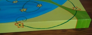
After working on Fear, I needed an antidote, so here is Relax, a comfortable composition reminiscent of the manicured grass, flowers, and water features of a well-run holiday resort. It’s deliberately clichéd because the familiar allows one to relax; nothing threatening here.
In the middle of the mandala, a floppy sunhat might hide me, sitting on a candy-striped beach towel. This mandala uses cool, relaxing shades of blue and green, with happy yellow and orange.
Surrounding me is a pool of blue water. The traditional four doors of the mandala have become four stepping-stones across the water. The pool sits on a lawn of green mowed in traditional stripes. Then there is a tangle of yellow and orange flowers that add some irregularity to the otherwise very structured elements.
Mandala No.14: Relax is painted in acrylic paint and finished in gloss acrylic varnish on a 50 cm x 50 cm gallery-wrapped canvas. The painting continues around the edge of the canvas as shown below. This mandala is signed on the back and could be hung in any direction.
It has been a while, but I have a number of new mandala’s nearing completion. Here is the first of the new batch: Interference.
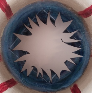
In this mandala, the traditional circle is no longer whole, instead we see a number of parts of circles, intersecting and creating interference patterns, like ripples on water. The result is a busy canvas, with a lot going on. Life often feels like this. It’s not entirely a bad thing. The interference sets up interesting patterns, like the dramatic star in the centre of the picture, and the busyness is stimulating, fun even.
But it takes effort and concentration to see the patterns, to find the parts of the circles. Each of the corners has a series of quarter circles spreading out from it. I extracted this image to try and focus my own attention on what was going on in just one corner of the canvas.
I’ve used high-energy yellow, orange and red in this mandala to reflect the energy that I feel when life is complex, full of projects and I’m enjoying all the activity. The cool blue edges are an attempt to bring some balance, to remind myself of the need to rest.
This mandala has some great shapes and textures in the detail. When life is busy it is filled with moments of beauty, but I am often not able to appreciate them. So Interference is also a bit frustrating, and tiring. There comes a point when I want more peace.
Mandala No.11: Interference is painted in acrylic paints on a 50cm x 50cm stretched canvas and finished with gloss acrylic varnish. It is not gallery wrapped and would look best framed in a floating frame.
Mandala No.6: Exuberant by Judy Backhouse (copyright)
Exuberant is very much like happy, but with a quality of excess, of wildness, of liveliness. According to the Oxford dictionary, exuberant means “lively and cheerful” or “growing profusely” and derives from words meaning “overflowing” and “abundantly fruitful”.
In this mandala, the traditional four doors are replaced with a bursting out of green, not only beyond the containing circle, but out beyond the frame of the picture. The vines have gone wild, looping, curling and squiggling with playful life, off the edge of the canvas and back again. Whoosh! Whee!
Exuberant makes use of my happy colours – yellows and oranges, sky blues and fresh green. In the centre is a cheerful orange and yellow flower surrounded by growing green. The blue surround gives an impression of water supporting all that growth.
Exuberant is painted on a 50cm x 50cm gallery wrapped canvas and the exuberant vines go over the edge and back on three sides. It is finished in gloss acrylic varnish.
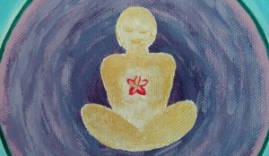
The Peace mandala tries to create a safe space in which I can feel enclosed, but not clastrophobic. To do this I changed the shape of the traditional square to give the sense of being able to see into other rooms, the expanded “doors”. This area is a calming blue edged with gold. My safe space is surrounded by a reassuring deep green beyond which a textured blue space provides a safe moat. Adding an uplifting note, little purple flowers edge this space.
In the middle of the mandala is a place of meditation, surrounded by a swirl of pinky-blues. Here I am, perfectly at peace.
The Peace mandala is painted in acrylics on an ordinary stretched 50cm x 50cm canvas. Although I have painted around the edge of the canvas, it would probably be best displayed in a light-wood or gold floating frame.
In case you are wondering about the numbering, I started working on Peace before Happy, but finished it after the simpler Happy. So Peace is No. 1 and Happy is No. 2.